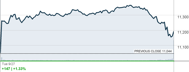
What’s wrong with the above graph of the stock market trading session today (September 27, 2011) showing a gain of 147 points? The first problem is today’s volume of 119,501,438 instead of the three month average of 213,568,870 shares traded. When does the price of any commodity go up when demand is down? Are we being played again by the Federal Reserve’s POMO policy?
The second point of interest is the hundred point drop in the last hour. This is the portion of the trading session when programmed trades and retirement account orders are executed. The volume is at its highest during this time and the market usually gains since there is concern for the price of stocks purchased for retirement accounts. This slide at the end of the day is similar to the pattern at the collapse in October 2008 when people dumped their mutual funds at the end of the day.
If we are in this same pattern, buckle up because the heaviest decline in the market occurred when people received their statements at the end of the month. Does anyone believe that the Greek/European Union crisis is actually resolved? I have lost track of the number of times that the Greek crisis has been fixed resulting in a worldwide rise of all stock markets.
David DeGerolamo


